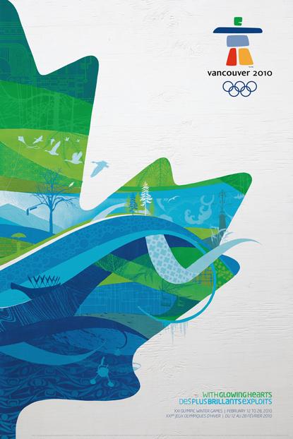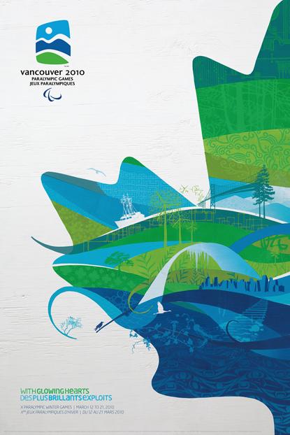


© VANOC/COVAN The Official Vancouver 2010 posters distill the detailed graphic identity that VANOC developed for the Games. Reaction to the identity has been mixed; while some appreciate the use of locally sourced textures and reference materials, others have described the style as ‘corporate clip art’. Designed as companion pieces, the posters form a single image when hung as a set.
Comments
KristenMay 27, 2012
Nice post which he Official Vancouver 2010 posters distill the detailed graphic identity that VANOC developed for the Games. Reaction to the identity has been mixed; while some appreciate the use of locally sourced textures and reference materials, others have described the style. In which nice color combination reaction to the identity has been mixed, while some appreciate the use of locally sourced textures and reference materials, others have described. Thanks a lot for posting this article.