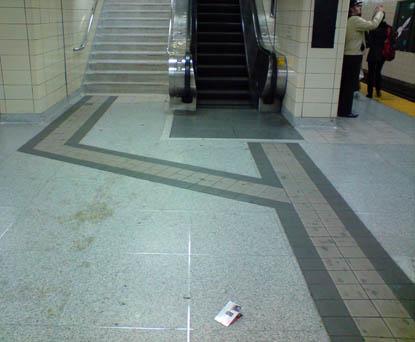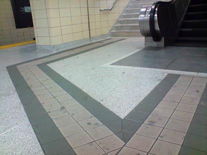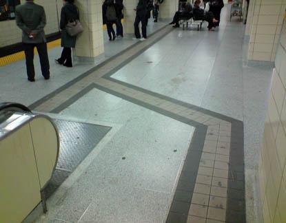


Design is everywhere we go, but sometimes it needs to be revealed so that we can really appreciate it. I always walked past these TTC Floor markings, and treated them as poor interior design choices until last year when I found out who they were created for. These simple strips, with their 2 types of ridges (inside and edge) and high contrast colours assist people with visibility issues to use the transit. This simple, accessible design opens up a world of commuting and city events to everyone.