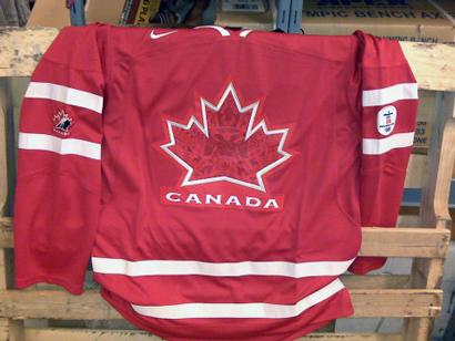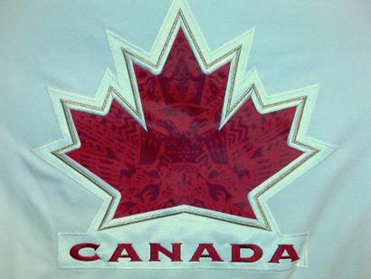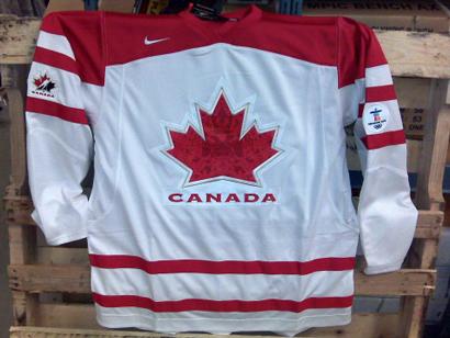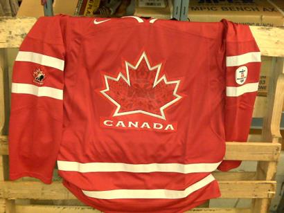


Hockey Canada will officially release the 2010 Olympic jerseys on Monday afternoon, but these leaked photos have already been making the rounds. The overall effect feels pretty classic, with strong references to vintage sweater designs. Probably the most striking element is the maple leaf itself, which incorporates a graphic pattern comprised of animal silhouettes, Salish looking designs and other Vancouver inspired motifs – nice detail.
Comments
gdurrellAugust 17, 2009
a little background on the logo redesign.
It’s an IOC Rule that the jersey’s worn by players cannot have any sport federation logos, which means the [Canadian hockey logo (with the hockey player inside the maple leaf, half red half black)](http://canadiandesignresource.ca/?p=5315) cannot be used, which is a shame.
But, all things considered I’m glad the new design here didn’t stray too far away from the original hockey canada logo.