


Photos: Hannah Wise
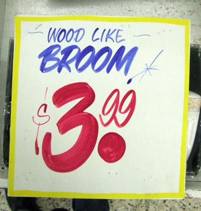
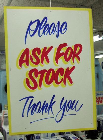
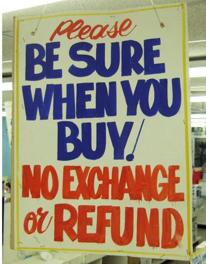
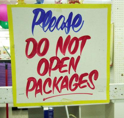
I am not sure that this work is wholly unique or original, at least in a strict design sense. Rather it is about what fits with the image of the store, and of the overall shopping experience. Reuben did not invent store sign painting, or the typography style that he uses most often in this work. What is unique is the application of these hand painted signs and that they are still being created in the age of the ink jet/ laser printers. The offness of them, they are never quite perfect (at least not in the computer way) and that they express an obvious human touch is very special, and something that is quite rare in our digital age (Digital process and production have pretty much eradicated this design/typographic sign painting language and style. Although there has been a recent hand drawn, DIY revival, it has largely remained in the design/art world and is not reaching into the general public).
Design is about experience and when you walk into Honest Ed’s you are confronted with an ocean of these little signs dangling from overhead. Everything, it seems, has one of these painted labels, creating a warm feeling of the handmade, and a charming old school experience (the comments on them are so fitting, with references like “pinching pennies”, etc). All of this combines into a solid positioning, and identity of Honest Ed’s…even his signage is honest and unmasked. The fact that Reuben is employed at all, demonstrates that this retailer cares about the impression they make, and understand that this typographic style generates a unique customer experience, helping the store to stand out from the coolness of other retailers (Nike Store), or the utter lack of design (The Bay) and the bleakness of efficient design (Wal-Mart).
Matt Kim did an excellent piece on this work, click to check it out.