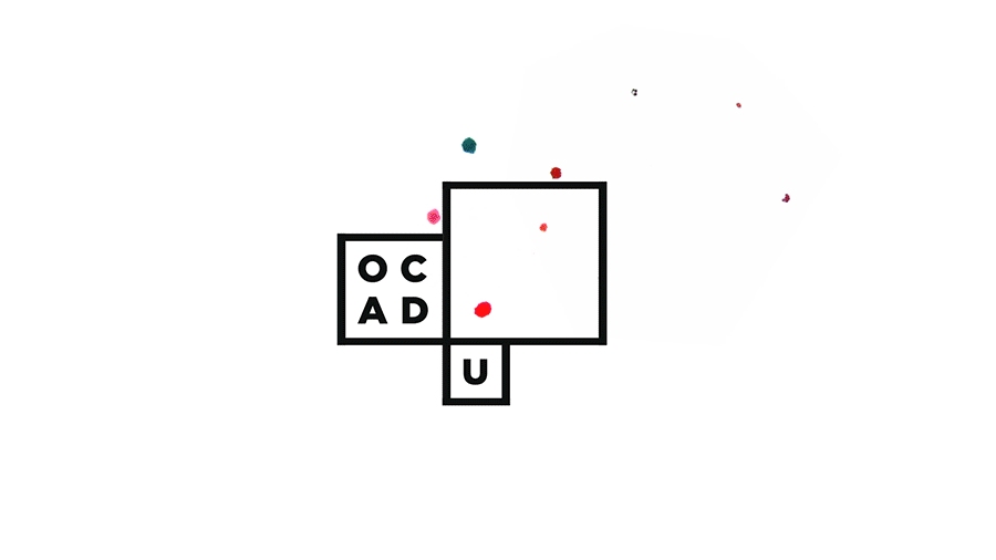
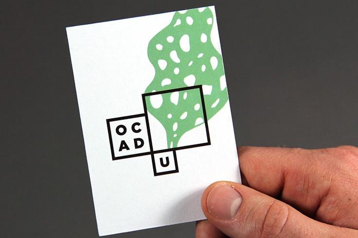
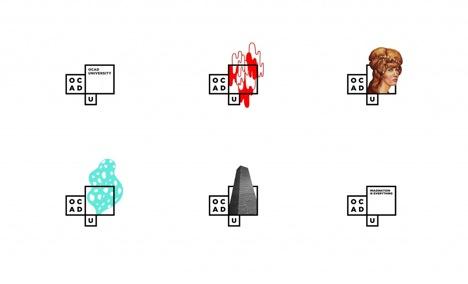
Adding to the steady stream of redesigned logos that this institution has rolled out over the years, this latest version may not have much time to set. This version replaces the 4 year old last version, and attempts to reflect the feel of the institute with a nod to the architecture (boxes), and a fluid form that makes room for award winning students to “design a logo within the basic window framework, providing the university with a set of logos for that year”. Meaning that the logo will change from year to year.
Comments
JSJune 1, 2011
Please save OCAD and fire Sara Diamond. The constant changing of logos and school identity is embarrassing. What a joke, I am sad that I went here.
Todd FalkowskyJune 1, 2011
Looks like some ooze spilled onto an element chart.
Poor OCAD, caught in an endless rebrand/identity roll.
kevinJune 1, 2011
I dont know what your complaining about, this is a wonderful idea, check out the video at this link and see if it sell sit for you
<http://www2.ocad.ca/visualidentity/>
njkJune 1, 2011
#brandingfail
Nora Brown AOCAJune 1, 2011
Yuck.
Spam MasterJune 1, 2011
No kidding, but I would add a hurl to the above.
Stephen JJune 1, 2011
I love it. I love how fluid it is. I love that it derives from the skin of Will Alsop’s building. I love the cleanliness with the room for messy visual embellishment. I think it epitomizes what design school should be, i.e. changing, personal, and creative, but with some common foundational elements.
Go check out the video that explains the new identity. I really enjoy it: <http://www2.ocad.ca/visualidentity/>
For all you paranoid internet dwellers out there, check out my bio on my Twitter feed (www.twitter.com/stephen\_job) to see that I have absolutely no vested interest in this design. I have no connection with OCAD or Bruce Mau whatsoever. I just love this new identity.
GnomeJune 2, 2011
That’s not a very nice thing to say about Adrian Forrow’s work Todd. He’s an amazing illustrator. I love the new identity — it’s fluid and dynamic, like the place. I can’t wait to see how it evolves over time. Brilliant!
glowJune 4, 2011
What the above description didn’t post was that the Bruce Mau logo for OCADU was a joint effort. He actually came into the school and worked with students, a collective effort. I think this process has as much value as the out come.
Todd FalkowskyJuly 27, 2011
I am liking this logo the more I live with it!