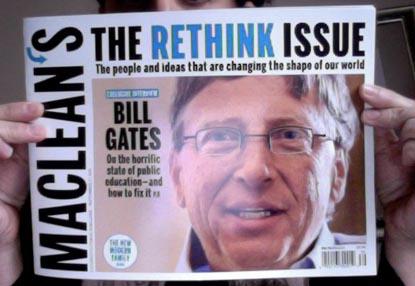
Packed full of trendy ways of blurring the hard lines between print and digital the latest issue of Maclean’s pulls out the stops: a cover that has gone from portrait into horizontal, AR codes, backwards printing and more. The design expresses the content of the issue very well, graphically supporting stories about contemporary ways of thinking and new approaches to living in our times…really great work.
Comments
HannahSeptember 24, 2010
Did Maclean’s team up with Rethink Communications on this? What struck me when I first saw it on the newstand was the bold, blue RETHINK in almost the same colour as the agency’s identity.
It’s a fabulous collaboration or the agency is tapping into some serious collective consciousness. Either way, good stuff!