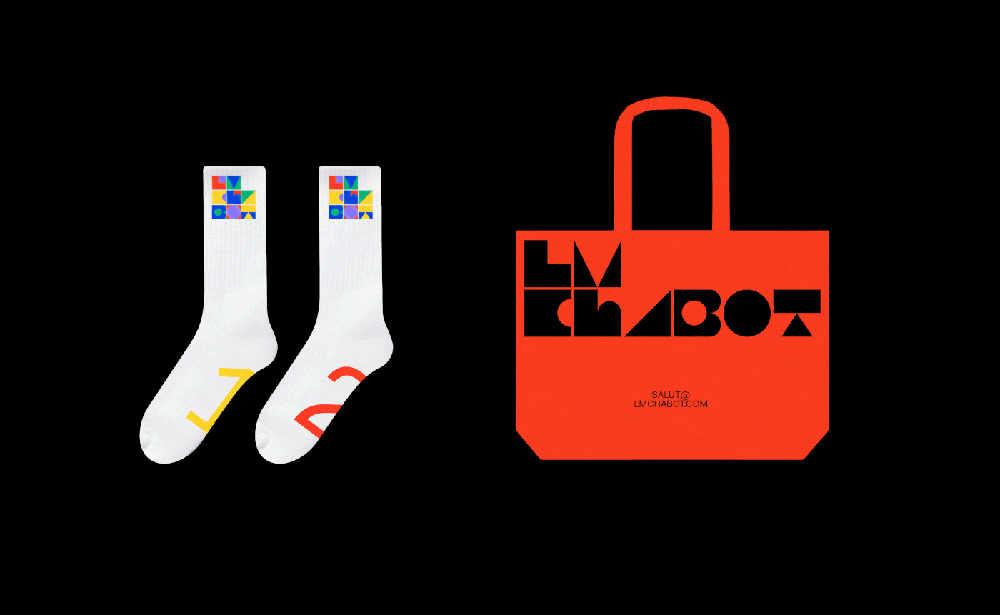
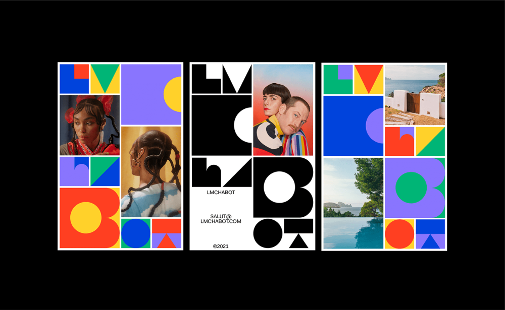
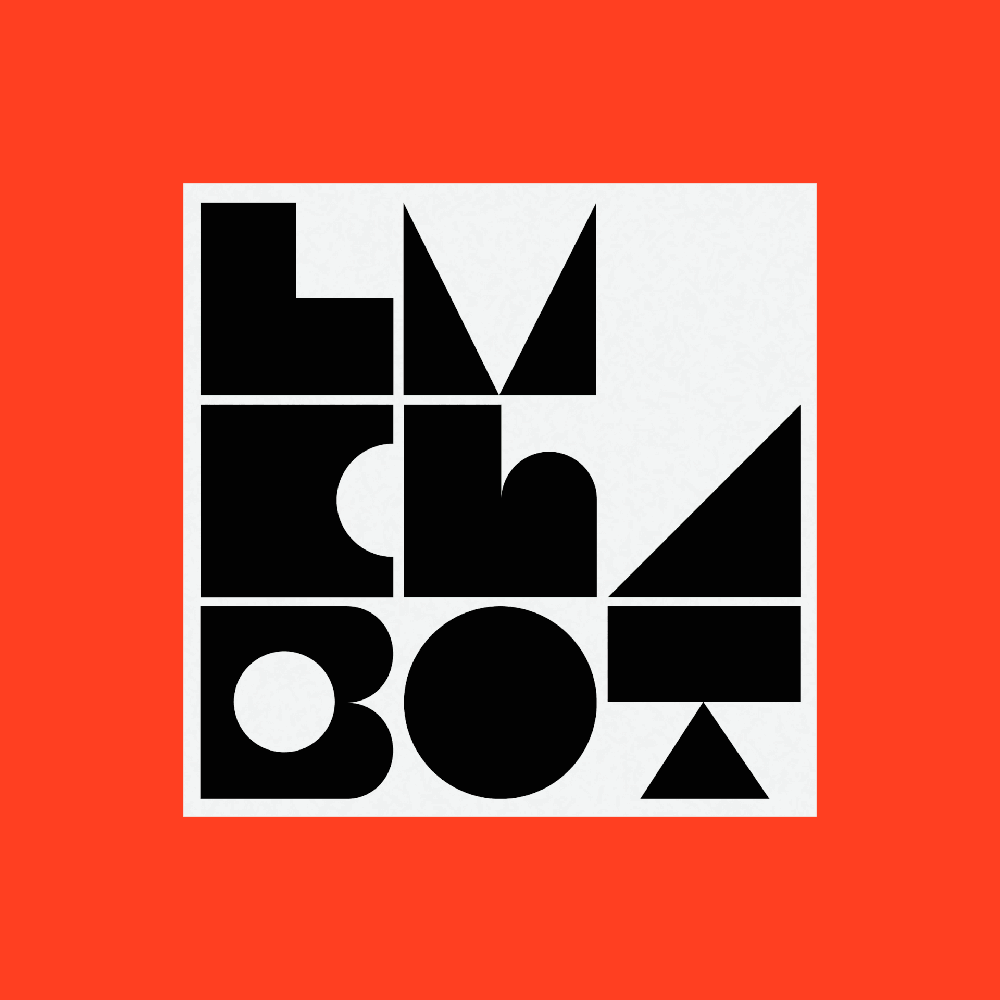
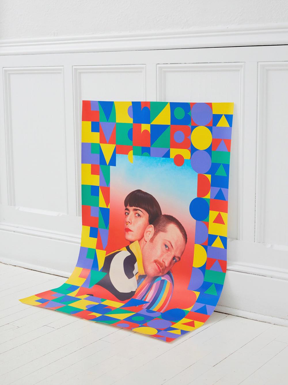
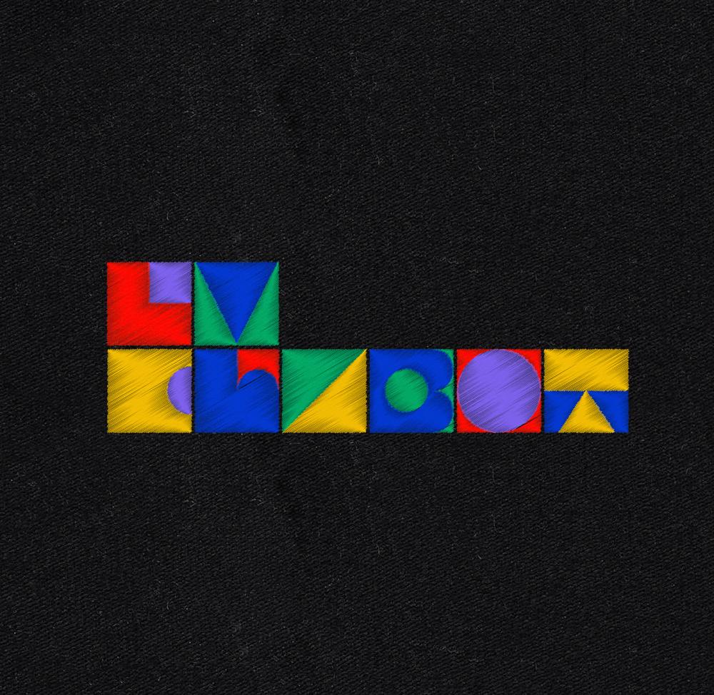
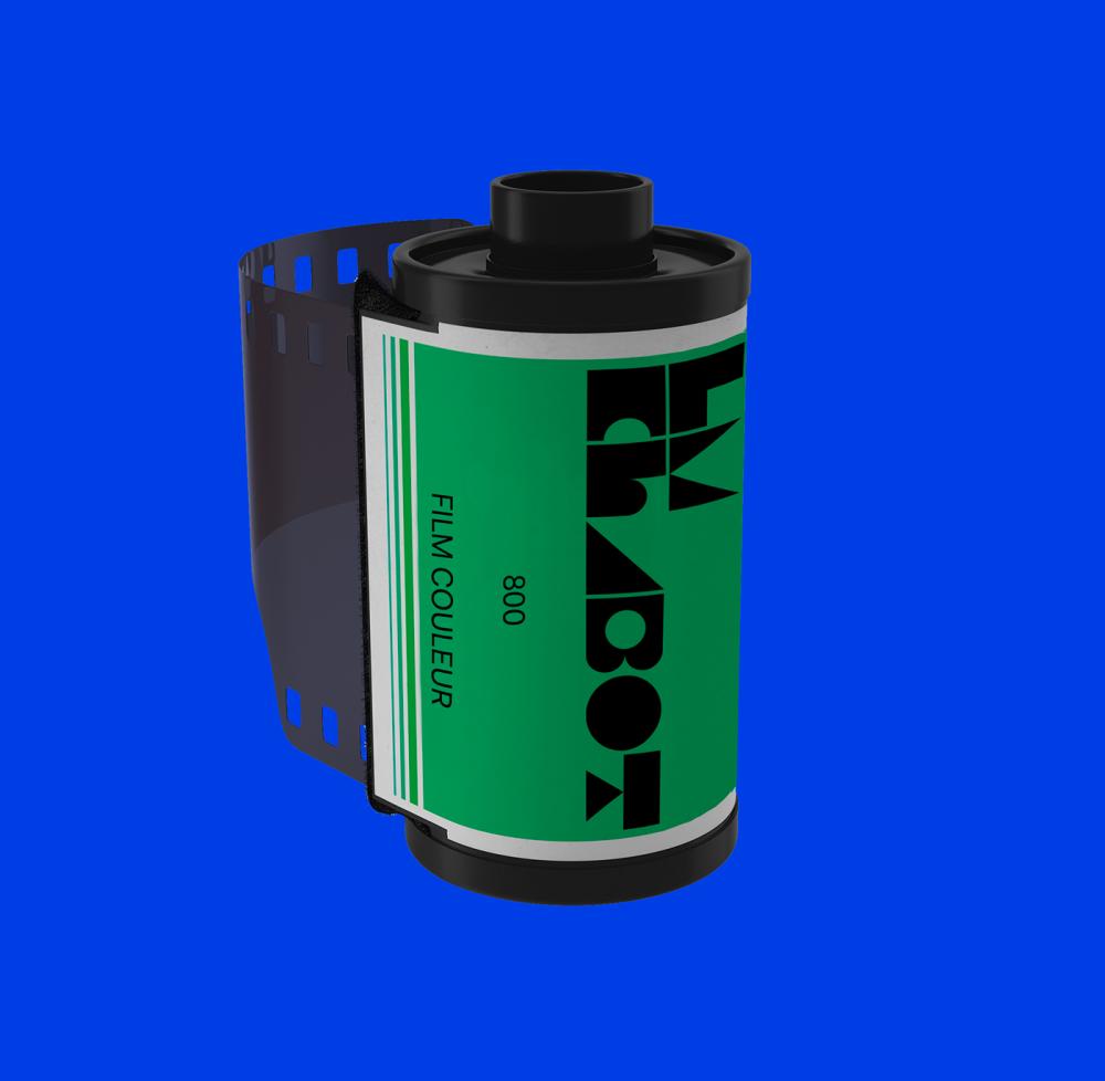
"Our mandate was to update their branding and their website so that their personality is put forward. We quickly noticed that in the evolution of their work a theme often came up, namely geometric shapes and flat colors. We wanted their whole identity to be colourful and flexible, both in terms of their signature and website. Working mainly with advertising agencies, it was important for them that their site allow the user to create their own inspiration board within the platform. This is why we have designed the interface in such a way that the content can be easily manipulated and downloaded."