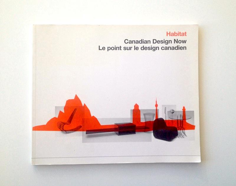
I’m not going to claim any kind of journalistic distance on this one. When I was part of Plastic Buddha, we shared an office with spacecadet design, so I was there when this was designed. Buddha was also in the Habitat show itself and I remember our excitement when the cadets landed this job because we knew they would create something amazing… and they did not disappoint! I believe, the budget limited the number of full colour photos of the work to just two per designer (and two shots of the show itself), so the silhouettes were conceived as a way to pull the designs through the rest of the book. And of course, they work beautifully. Combined with the carefully handled type (Karla’s blood and sweat are in those details), the compositions are so striking that I think the two colour pages are actually the highlight of the catalogue. Which is not to say that the design competes for the readers attention – it’s actually quite subdued and treats the work with great respect – just that it works better in print than a lot of the exhibit’s content. The bravest move here is probably the cover. The original idea was to ‘close cut’ some of the objects (removing their backgrounds) and place them within the abstract landscape. To get a feel for which objects would work, it was first mocked-up with the backgrounds intact and the opacity turned down. But, once everyone had a look at the mock-ups, that was it. The overlapping rectangles bring a lot of visual interest and play nicely against the red landscape (without blocking it out completely), and most importantly this approach contemporizes the design. The end result references the kind of Canadian modernism familiar from high school text book designs, with a twist that boldly flaunts the role of modern technology in its creation, which is fitting given the title.