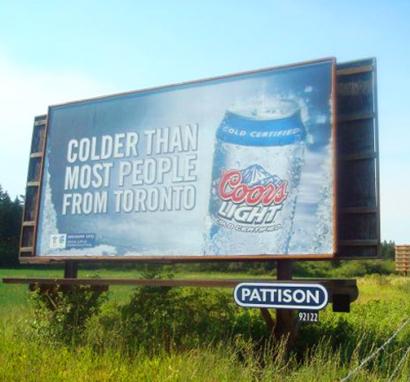
The fact that it was produced in Toronto did not stop the controversy around this ad, which of course, was the point. Before being pulled earlier this week, this billboard received attention from almost every major news outlet (print and tv) in the country (and Baltimore too). Not bad for only 30 billboards in just one market (Vancouver). As controversial ad campaigns go, this seem pretty tame… predictable and generally uninspired. Maybe we should take offense to that!
Comments
RicAugust 20, 2009
stupid overreaction. Can’t take a joke.
Darcy McGeeAugust 20, 2009
Bunch of whiners in Toronto.
It was a crappy ad anyway.
IngridAugust 21, 2009
Having lived in both cities: no more cold than Vancouverites (who are 80% Torontonian anyway). Not offensive, but not clever either.
AdamAugust 21, 2009
Agreed. What would ever cause them to pull it? Oh no, they called us “cold”…
T FalkowskyAugust 24, 2009
Good planning, the whole campaign, including the backlash was well designed.
Media loves a controversy and will plug into any, regardless of the source. Smart brand agencies get this, and are able to roll out programs with “backlash” built in. It grabs headlines and pushes brands and campaigns higher (I saw the Coors management being interviewed by CBC, who were demanding answers, and there was a huge Coors banner in the background)
Critique the campaign for sure, but to bash it because of the controversy and you are ripping on something that amounts to good design.
Until genuine reporting makes a comeback, with working reporters and writers, this style of advertising will increase. I just hope that the public is not confusing news with ads…but I fear that this is already the case.
T
-wrMay 8, 2010
Bad planning. The whole campaign. The adage that “all media is good media” was completely obliterated over a decade ago. Just ask Toyota how they are doing right now.
The backlash hurt sales. A dip in the GTA – no change anywhere else to compensate.
Amusing a hundred thousand people at the expense of 3 million is reason to fire your agency. The ad itself is not clever, well designed or well written and when I came across it online I assumed it was from the 1980’s. It might have been funny then.