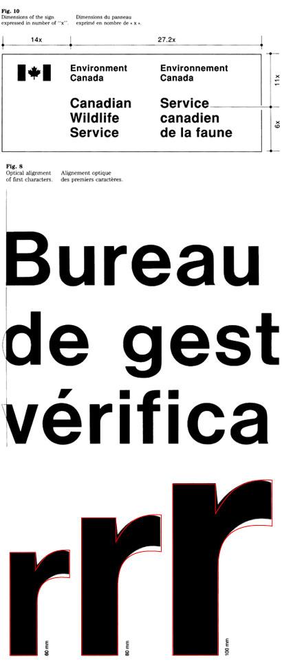
I had always assumed that the Canadian Government used Helvetica for all of its brand outputs — but after spending far too many hours staring at a sign hanging from the ceiling of my local passport office, non-Helvetica flourishes began to appear (see ‘r’ comparison above with Helvetica Medium overlaid in red). At first I assumed that, like so many large institutions, various smaller agencies within the larger whole had gone off-brand by substituting Arial or Helvetica Neue for Helvetica proper (because whoever made the sign was using a PC, or didn’t know any better, or some combination of the two), but after a bit of design geekery (apparently government offices don’t like you taking hundreds of detail shots of their signage) and some googling, I came across Section 4.5 of the Federal Identity Program’s Usage Manual, aptly titled ‘signage typeface’. Apparently the government adopted a typeface variant based on Helvetica Medium, yet decidedly incompatible with original. The FIP manual gives no real reason for this decision, but I would assume that either A) the government felt Helvetica just wasn’t good enough for wide-scale, standardized usage in signage, and decided to spend a large sum of money on a detailed analysis of the optical failings of the original and how best to improve the typeface (not so likely), B) whoever designed the first signs didn’t have Helvetica Medium, substituted their own variant and then spit out a whack of post-design-rationalization in the form of Section 4.5 of the FIP manual (somewhat likely), or C) some combination of A as instigated by B (most likely). If anyone has further details on the story behind this typographic oddity, please let us know — it would probably make for a better entry than my highly-biased guess-work.