Designer

Karim Rashid

Client

XO!

Category

Furniture

Date
2009
Source

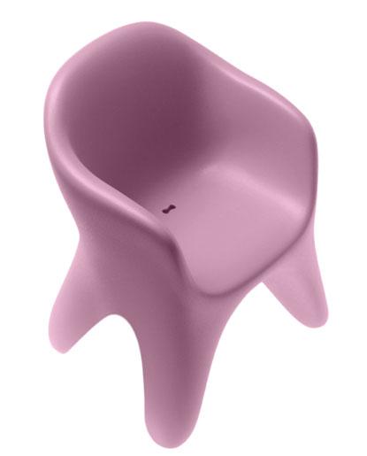
Adding to the massive pile of pink blobjects, almost shockingly we are presented with another one. With an unpleasant and confusing name, perhaps a call out to the design press who have grown tired of this style, Rashid appears to be dipping back into his well of shapes. A short list of forms that by this time seem more connected to the past than to the future. Even the seat pan features one of his karimglyphics as a drain hole. Obviously convinced that the zoomorphic style still has currency, or that the design public is not savvy enough to notice, or that brand Karim still matters, xO has decided to roll this out to the marketplace. Which honestly must be getting rewarded with press and sales, or they would not be doing it. The reality is that the soft and approachable form is quite pleasant and usable, can be used indoors or out, is available in a range of colours (including Rashid’s second go to colour, florescent lime), and the material choice is thankfully recyclable but not biodegradable, and will still take centuries to break down. I am a fan of a large part of this savvy designers work, but I am getting weary of the bottomless volume of work that seems to have all been created in the same afternoon. I am looking forward to the time when the designer will unlock his vast experience and volumes of serious product designing skills to create meaningful work, embracing real issues and the genuine needs of the cultures we represent. We have gotten glimpses of the designers sharp vision and sensibility, and want more.  

Comments

EBMay 7, 2009
I agree with your points, except one. The form is not pleasant, or savvy, it looks like the bucket booster seats available at the local family restaurant. Karim Rashid must be close to the end of his list of available objects to apply this style to, having done everything from dog bones to interiors. Fingers crossed that this is the last one, and that he will be moving on.
j bowlesMay 7, 2009
Its called Bite Me because it’s in the style of a molar
EBMay 7, 2009
Why would a chair be designed in the “style of a molar”? “Bite me” has a vulgar, juvenile and negative tone and I wonder how this made it past the marketing folks at xO. I guess like most popular culture these days, it is the lowest forms that grab attention. Designers get away with murder these days, and some of the most famous seem to be the biggest criminals.
j bowlesMay 7, 2009
I honestly couldn’t tell you but I definitely see the posts of the molar as the legs of the chair, and the indentation of dentin as the recessed seat area of the chair <http://farm2.static.flickr.com/1060/1108358880_173e2b5baa.jpg?v=0>
sf_designerMay 8, 2009
my first thought is that the drainage hole is what will bite you- in a most unpleasant spot. the way it’s shaped, it looks like something might snag on it when you sit down. personally, I love that it looks like a molar. I want one of these chairs!
erlMay 12, 2009
Wendell Castle: Molar Chair, 1968.
LindsayJuly 6, 2009
Todd, thank you for doing your part in making Karim’s cynical, ugly, plastic, wasteful stuff just go away. I got a toothache just looking at this thing.
Privacy
Terms of Use
API
Problem with an entry?